Starward Whisky
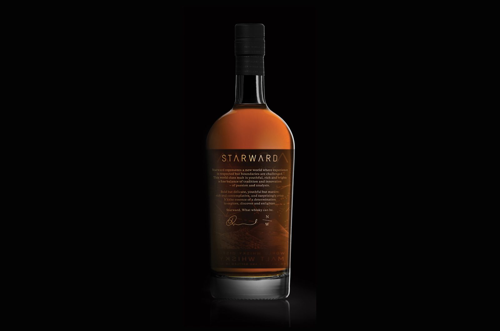
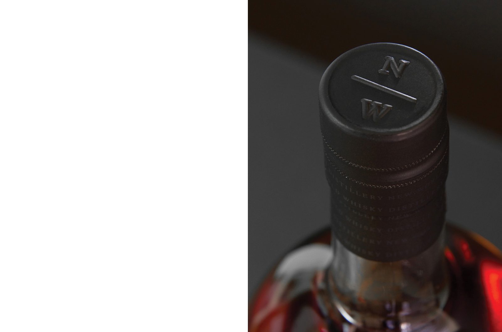
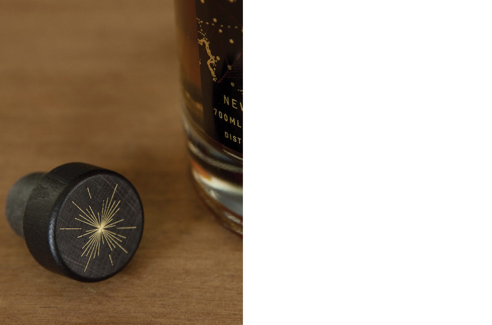
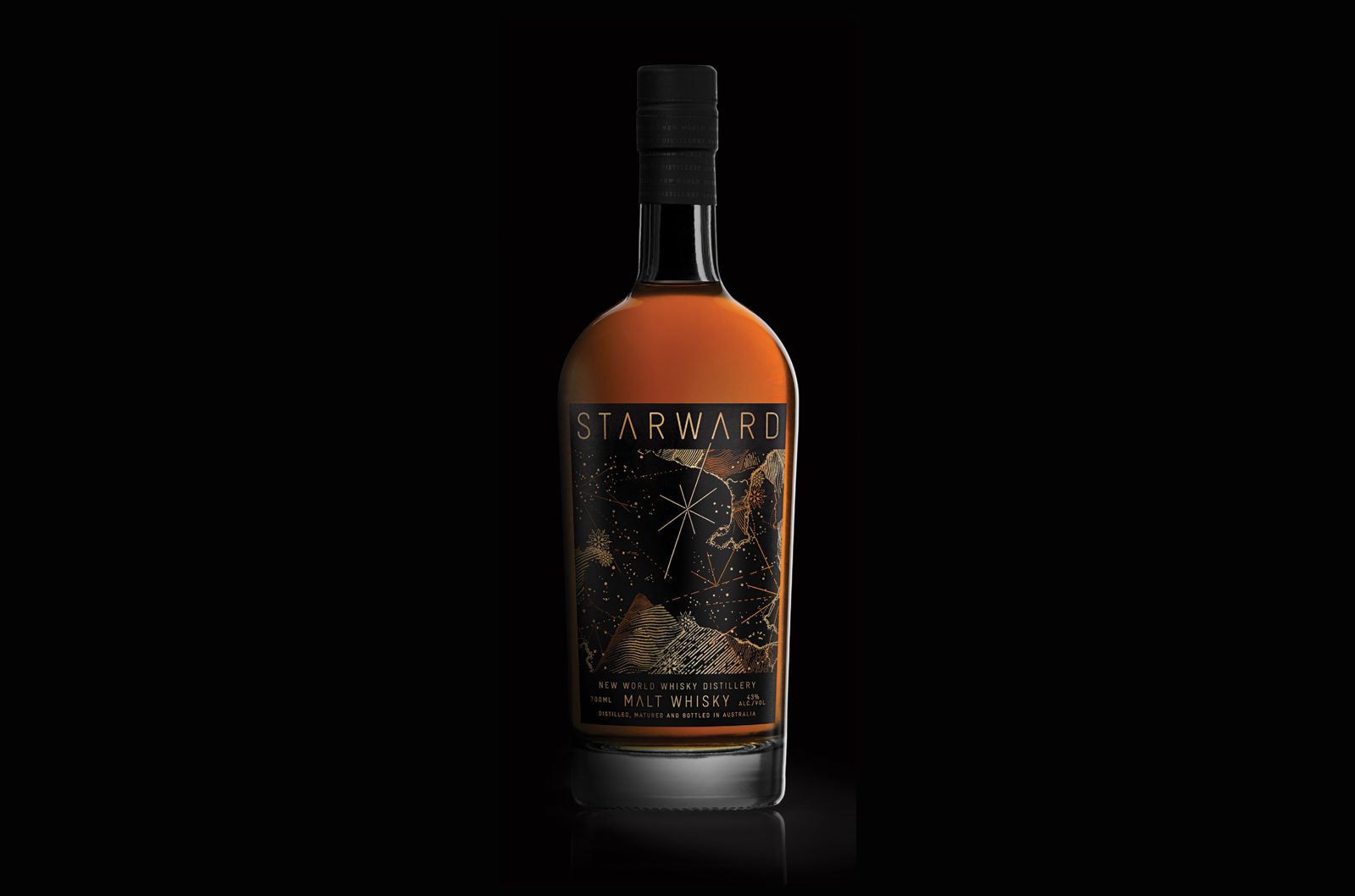
The client set out to create a whisky inspired by Melbourne, one that pushed boundaries in both production methods and craft. Tasked with naming the product, extensive workshops were conducted resulting in the outcome of Starward, referring to the act of looking towards the stars. This was befitting of the aspirations and determination of the client’s vision. The first release of Starward bottles were screen printed with 24ct gold with the distillery logo embossed on the stelvin, when opened it revealed a screen printed starburst motif on the cork top.
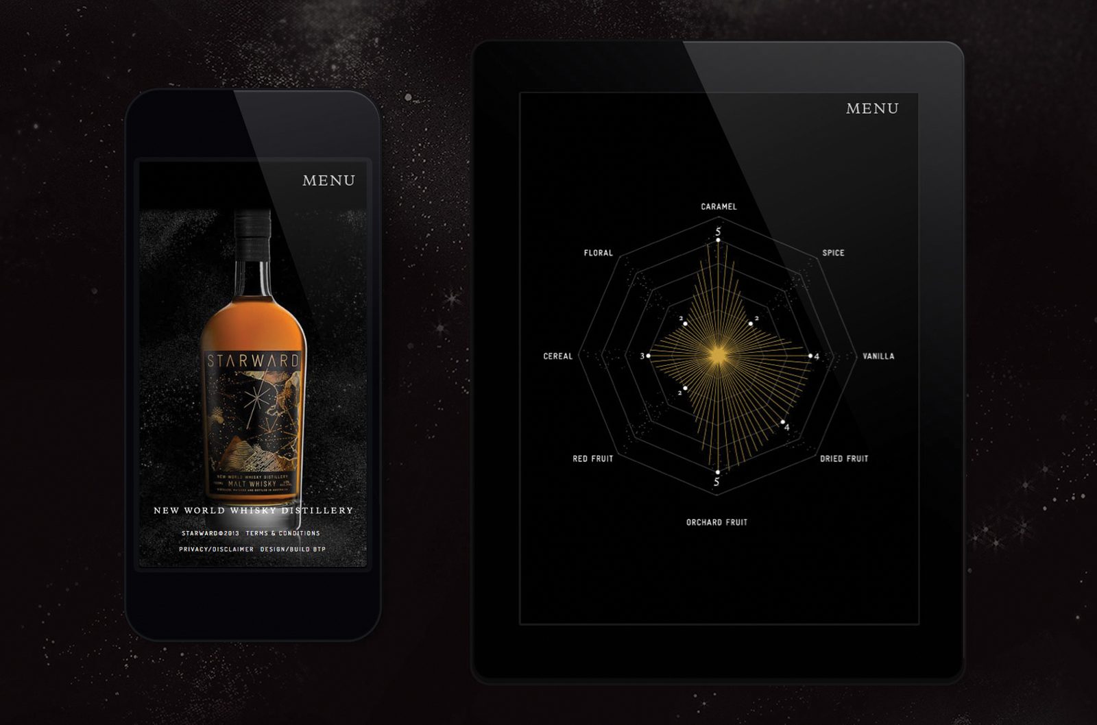
Brand strategy – Naming – Packaging – Digital – Promotional design